ShopDreamUp AI ArtDreamUp

Deviation Actions


Suggested Deviants


Suggested Collections


Description
24" x 36" x 2"
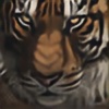
Scratchboard and Ink
This is a commission I just finished. The client loved Majestic 1 but it sold so we worked out a plan for this picture. I'm not crazy about it - I think the proportion is off and this just goes to show that I have to stick to my guns and follow my own rules. I let the client have too much input - I meshed two photos together to get this pose which I ABSOLUTELY hate to do. It's just a recipe for disaster - when you work in such minute detail - it's the little details that get lost when you try to change the pose.
In the end the client was happy so it's a win but it'll always be at the bottom of my favorites list.
Image size
4396x2909px 3.16 MB
Make
NIKON CORPORATION
Model
NIKON D7000
Shutter Speed
10/5000 second
Aperture
F/4.8
Focal Length
86 mm
ISO Speed
800
Date Taken
Dec 1, 2011, 3:06:05 PM
© 2011 - 2024 Heatherzart
Comments24
Join the community to add your comment. Already a deviant? Log In
Heather- You know I am a huge fan of your scratchboard. I have always found inspiration in your works, the detail, the color, and the anatomy. (:
On to the critique-Vision: low stars because when you click to see the full drawing, you see the anatomy is off. Now, I am not one to comment on big cat anatomy, and I know you had to mash two photos together, but you can see a small mistake of the left side of the head. It is too triangular, and the fur it kind of "there" while the head shape itself is fine, the fur gives it almost a lop-sided look. While most of your works are vivid, lithe, and almost look like they could walk off the board, this one is slightly stagnant, and I think it is due to the head proportions to the body. Not fixable on this work, I understand, and you probably know just what I am talking about (:
Originality: Because it is a commission, and I am assuming this is the "exact" pose they needed to have, it gets lower marks due to its average placement. You usually have them "doing" something, cleaning, walking, looking about to pounce. This one looks slightly askew because the head is not on the right position compared to the body.
Technique: Compared to your other Majestic, this one seems a bit too bright, and under-contrasted. It does not look like it has enough shading for a hyper-realism work, giving it almost a stuffed animal look. The fur on the back looks like a soft blanket, instead of moving, alive fur on a baby tiger. This, again, might be due to no full view to see detail, as well as possibly a bad photo of the work. The chest area could do with some more shadows, as well as the head, even if the lighting is on the left side.
Impact: Because it is a scratchboard work, it gets high impact marks just because there are only a handful of people who could accomplish detail of this kind in that space. It takes lots of skill, patience, and hard work, and very little room for mistake and error. I love the tiger itself, and I know babies are, as a rule, harder to draw or paint because of their disproportionate bodies. You did a magnificent job with the circumstances, but next time, put your put down and as the artist, you must decide how you want it to look. A few rules are good, but with this kind of work, you really need the ability to use your artistic judgment and freedom! ^^
Brilliant job!